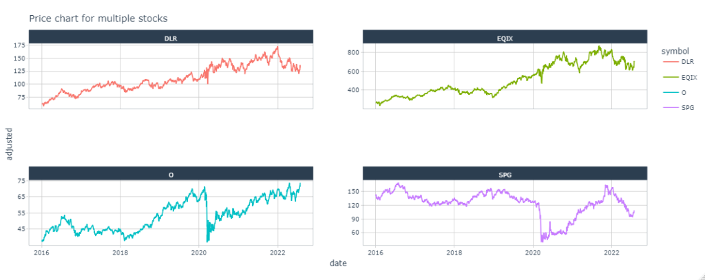
The purpose of this post is to use R to visualize the stock price fluctuations of listed companies and the S&P500. A basic stock graph tracks two variables: time and price. Label the x-axis, or horizontal axis, time when creating a graph. Price should be labeled vertically, or on the y-axis. This guarantees that as the line graph travels from left to right, it represents price rises (by moving up) and declines (by moving down) over time.
# import libraries
library(tidyverse)
library(tidyquant)
library(plotly)

# download stock prices
ticker <- "EQIX"
stk_df <- tq_get(ticker,get='stock.prices',from="2018-01-01",to="2022-08-01")

# plot stock prices
p <- stk_df %>%
  ggplot(aes(x = date)) +
  geom_line(aes(y=adjusted)) +
  ggtitle(paste0(ticker," stock price")) +
  scale_x_date(date_breaks = 'years',date_labels = '%Y-%b') +
  labs(x='Date',y='Price') +
  theme_tq()

# visualize plot
p

# visualize interative plot
ggplotly(p)

# download mutliple stock prices
tickers <- c("EQIX","O","SPG","DLR")
stk_dfs <- tq_get(tickers,get='stock.prices',from="2018-01-01",to="2022-08-01")

# plot mutlipe stock prices
p1 <- stk_dfs %>%
  ggplot(aes(x = date, y = adjusted, color = symbol)) +
  geom_line() +
  scale_x_date(date_breaks = 'years',date_labels = '%Y-%b') +
  labs(x='Date',y='Price') +
  facet_wrap(~symbol, scales = "free_y") +
  ggtitle("Price chart for multiple stocks") +
  theme_tq()

# visualize plots
p1

# visualize interative plots
ggplotly(p1)

# make them into a function
price_plot <- function(ticker,start_date,end_date,interactive=F) {
  stk_df <- tq_get(ticker,get='stock.prices',from=start_date,to=end_date)
  if(length(ticker)>1) {
    p1 <- stk_df %>%
      ggplot(aes(x = date, y = adjusted, color = symbol)) +
      geom_line() +
      facet_wrap(~symbol, scales = "free_y") +
      ggtitle("Price chart for multiple stocks") +
      theme_tq()
  } else {
    p1 <- stk_df %>%
      ggplot(aes(x = date, y = adjusted, color = symbol)) +
      geom_line() +
      scale_x_date(date_breaks = 'years',date_labels = '%Y-%b') +
      labs(x='Date',y='Price') +
      facet_wrap(~symbol, scales = "free_y") +
      ggtitle("Price chart for multiple stocks") +
      theme_tq()
  }
  if(interactive==T) {
    p1 <- ggplotly(p1)
  }
  return(p1)
}

# download US REIT stock prices
# https://reitsinvestors.com/us-reits/
tickers <- c("EQIX","O","SPG","DLR")
start_date <- '2016-01-01'
end_date <- '2022-08-01'
price_plot(tickers,start_date = start_date, end_date = end_date, interactive = T)
Now you can visualize stock prices in R!


 by
by